PAIN POINTS
WHY
IMPROVEMENTS
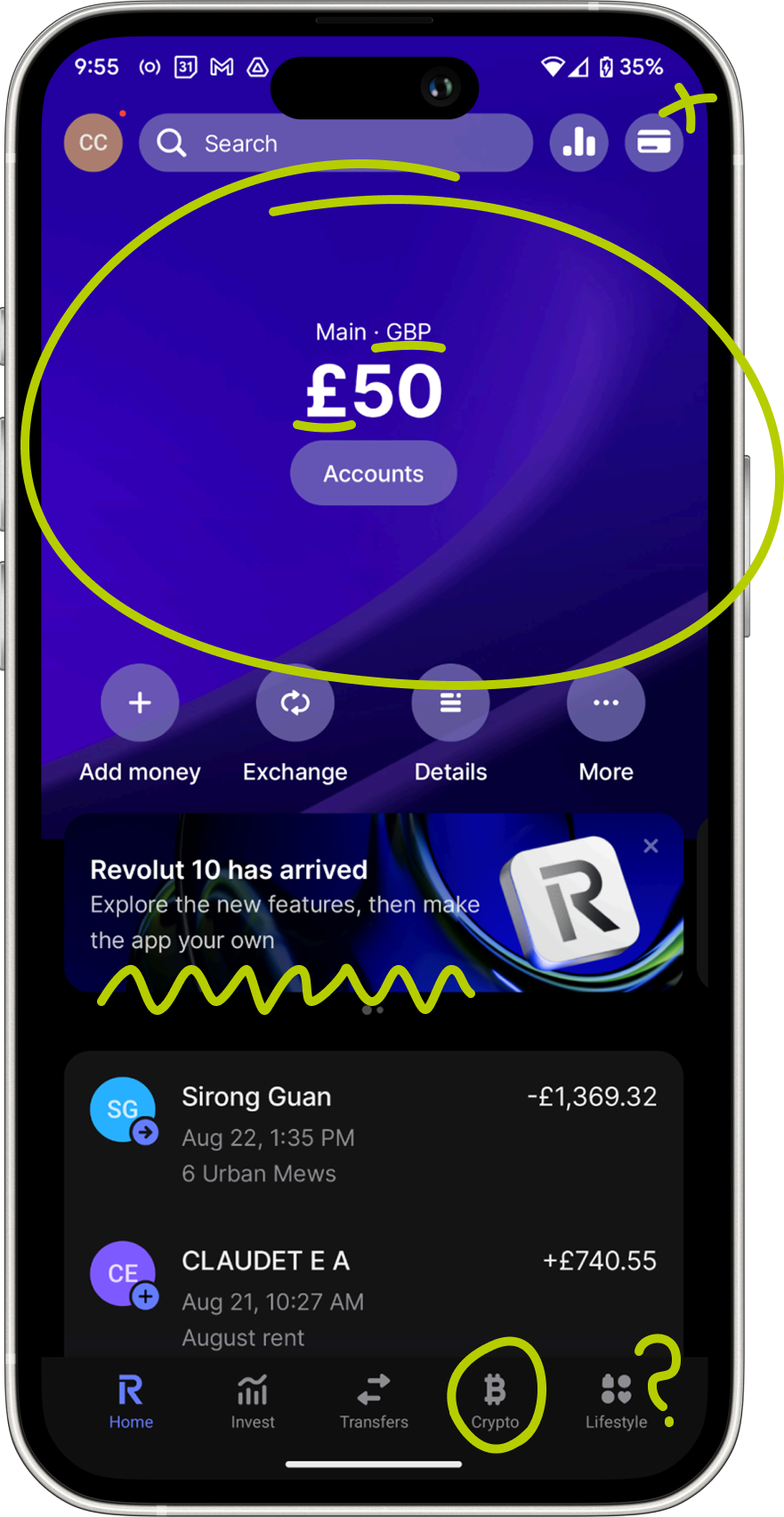
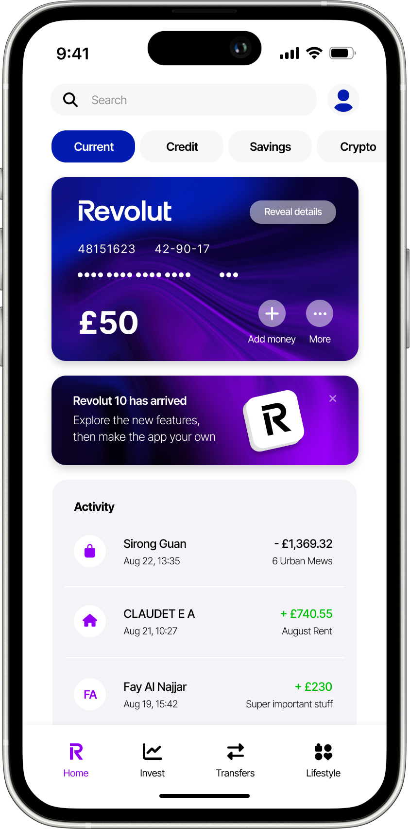
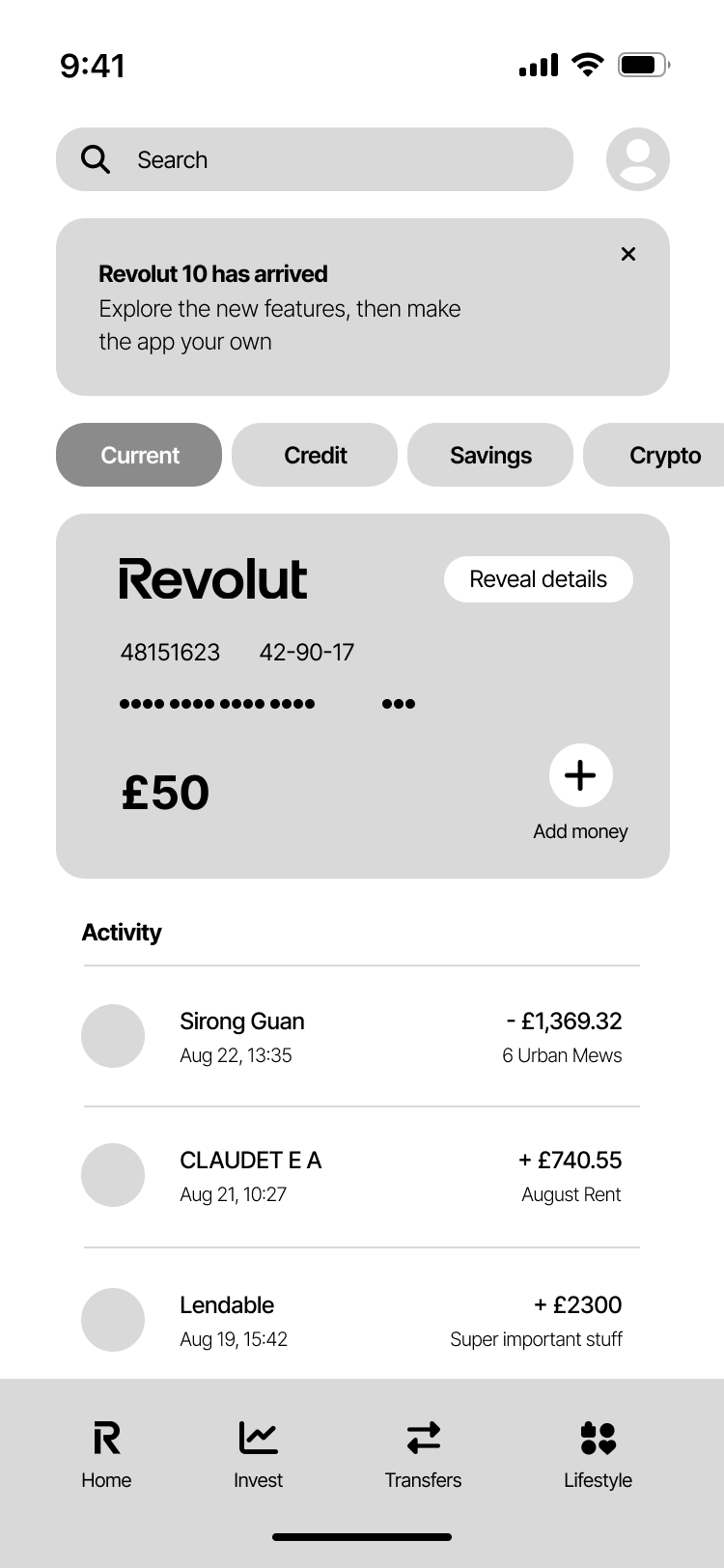
No account details at a glance
USABILITY
INTUITIVE NAVIGATION
Too many clicks for a quick task. Wasted real estate in hero section with too much blank space and repetitive information (GBP and £) - could be used more purposefully
Make card details visible at first glance, with a ‘shake to reveal’ more private card details for security purposes
Navigation between accounts
ACCESSIBILITY
SIMPLICITY
INTUITIVE NAVIGATION
Accounts navigation (e.g. current, savings, credit) should be clear and quickly accessible
Clearly labeled buttons above the card to indicate which card you’re viewing, and easily navigate between others
Cluttered theme, too busy
ACCESSIBILITY
SIMPLICITY
COGNITIVE LOAD
Clashing background and advert make it hard to digest information and navigate product. Advert doesn’t stand out either
More white space, utilising colour to highlight information hierarchy and important announcements/adverts. Enhances and simplifies navigation
Unclear bottom menu bar
CONTEXT
COGNITIVE LOAD
Crypto is not applicable to everyone, so this might exclude certain customers. It’s also unclear what ‘lifestyle’ is for?
Rename menu items, moved crypto to money management type next to cards