ROLE: Designer + marketeer // passion project
Pact:
Coffee rating and ecommerce app
B2C
App
eCommerce
Product
Marketing
UI
UX
Pact is a coffee brand that prides itself on flavour and quality.
If you're on their subscription service, you are meant to be able to rate what you try as they learn your taste and fine-tune what they send to you, so your coffee keeps getting better.
Problem: Presently, there is no easy or user-friendly way to rate what you try.
If you're on their subscription service, you are meant to be able to rate what you try as they learn your taste and fine-tune what they send to you, so your coffee keeps getting better.
Problem: Presently, there is no easy or user-friendly way to rate what you try.

Overview
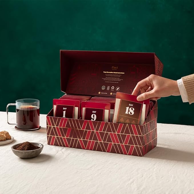
After purchasing the Pact advent calendar for my partner (and perhaps opening a few myself...), I became frustrated with the fact that the their UX fell short - not to mention missed out on some major sales opportunities. The perfect disaster for my Product designer/marketing exec brain! So I took it upon myself to create an app to accompany the physical advent calendar, which allowed users to rate their coffee as each day passes.
At the end of the 25 coffees, the user will have collated a summary of their preferred coffee flavours, acidities, and much more - learning about the kinds of coffees they like with the added ability of purchasing more directly from the app. Not only would this increase customer loyalty through repeat purchases and coffee recommendations, but it also provides the customer with an opportunity to order more of their favourites with ease!
At the end of the 25 coffees, the user will have collated a summary of their preferred coffee flavours, acidities, and much more - learning about the kinds of coffees they like with the added ability of purchasing more directly from the app. Not only would this increase customer loyalty through repeat purchases and coffee recommendations, but it also provides the customer with an opportunity to order more of their favourites with ease!
* Product
Tap each screen to find out more!

LOGIN
The login experience was designed to create a frictionless entry point into the Pact ecosystem while reinforcing the brand’s premium yet approachable identity.
I focused on reducing cognitive load by keeping the interface intentionally minimal, using clear hierarchy, concise copy, and familiar authentication patterns to help users access the app quickly with minimal effort.
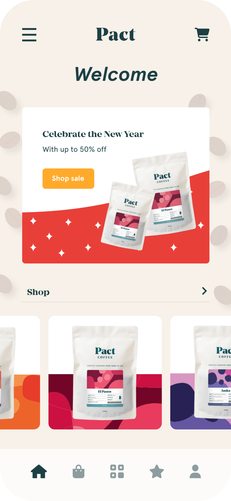
HOME
The home page acts as the central hub of the application, designed to help users quickly navigate between discovery, purchasing, and engagement features. My goal was to create a dashboard that felt personalised and content-rich without becoming overwhelming. I prioritised the most relevant actions: scanning coffees, viewing recent ratings, and browsing products; all while maintaining a clean layout supported by clear information hierarchy and modular card-based components.
This screen demonstrates my approach to balancing business goals with user needs. By surfacing key interactions and recommendations early, the design encourages repeat engagement and product exploration while maintaining an enjoyable browsing experience.
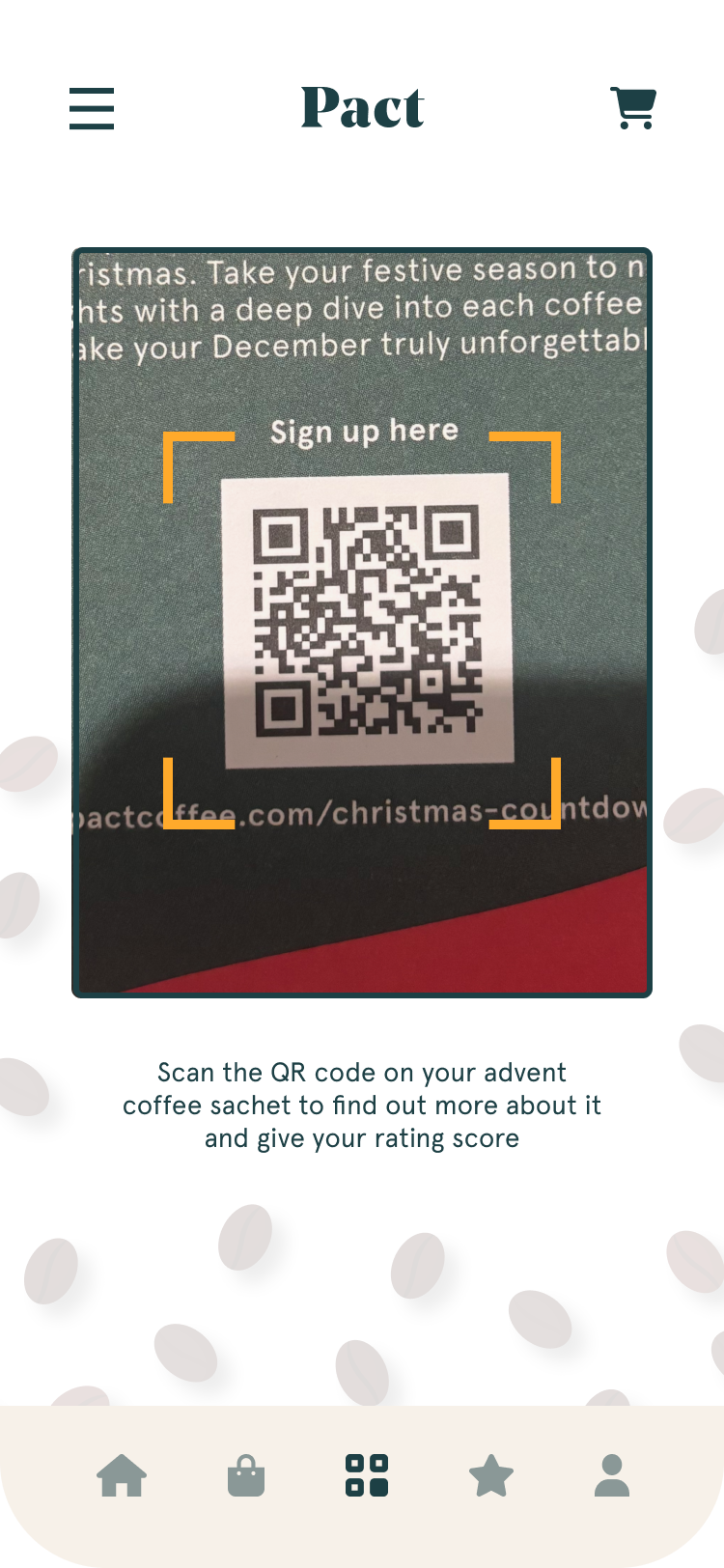
QR SCAN
The QR scanning experience was designed to bridge the physical and digital journey of Pact’s advent calendar experience. I focused on making the interaction feel immediate and rewarding by simplifying the scanning flow and minimising unnecessary interface elements that could distract from the primary action. The camera interface uses clear visual framing and feedback states to reassure users during the scanning process and reduce uncertainty.
From a product design perspective, this feature was particularly focused on creating engagement beyond the initial purchase. By connecting each coffee to an interactive rating journey, the scan experience encourages repeat app usage and strengthens user participation throughout the advent calendar campaign.
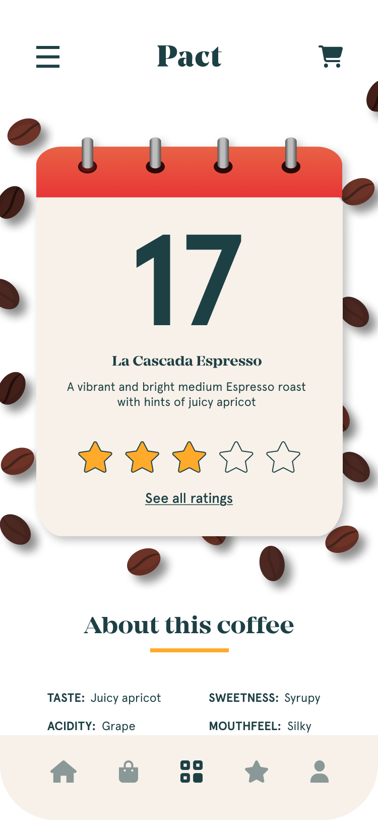
ADVENT CALENDAR
The coffee rating page was designed to turn a simple feedback action into an engaging and memorable experience. I focused on creating a lightweight interaction that encouraged users to quickly submit ratings while still feeling emotionally connected to the product they had just tried.
Visual hierarchy, imagery, and microinteractions were used to create a sense of delight while maintaining clarity and ease of use.Beyond usability, this screen supports valuable business and community outcomes. The ratings flow encourages habit formation and deeper product engagement while generating meaningful customer insights for Pact.
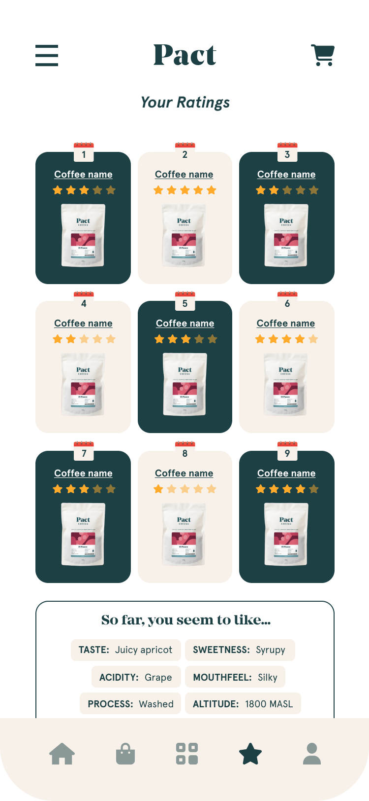
COFFEE RATINGS
The ratings page was designed to give users a personalised overview of their coffee journey and encourage long-term engagement with the platform. I wanted the experience to feel reflective and rewarding, allowing users to easily revisit coffees they had tried while identifying favourites and patterns in their preferences.
The layout uses clear visual organisation and consistent card structures to make browsing historical ratings intuitive and enjoyable.From a product thinking perspective, this feature helps strengthen user retention by creating a sense of progression and ownership within the app.

COFFEE SHOP
The coffee shop page was designed to support product discovery in a way that feels curated rather than transactional. I wanted users to explore coffees with the same sense of craft and quality associated with the Pact brand, so the interface prioritises strong product imagery, clear categorisation, and concise product information. The browsing experience was structured to support both intentional shopping and casual exploration.
From a UX perspective, I focused heavily on navigation and filtering behaviours to ensure users could move through a potentially large product catalogue efficiently. I also considered commercial goals such as increasing product visibility, encouraging repeat purchases, and promoting seasonal offerings. The design system was built to scale easily across additional product categories while maintaining consistency throughout the shopping experience.
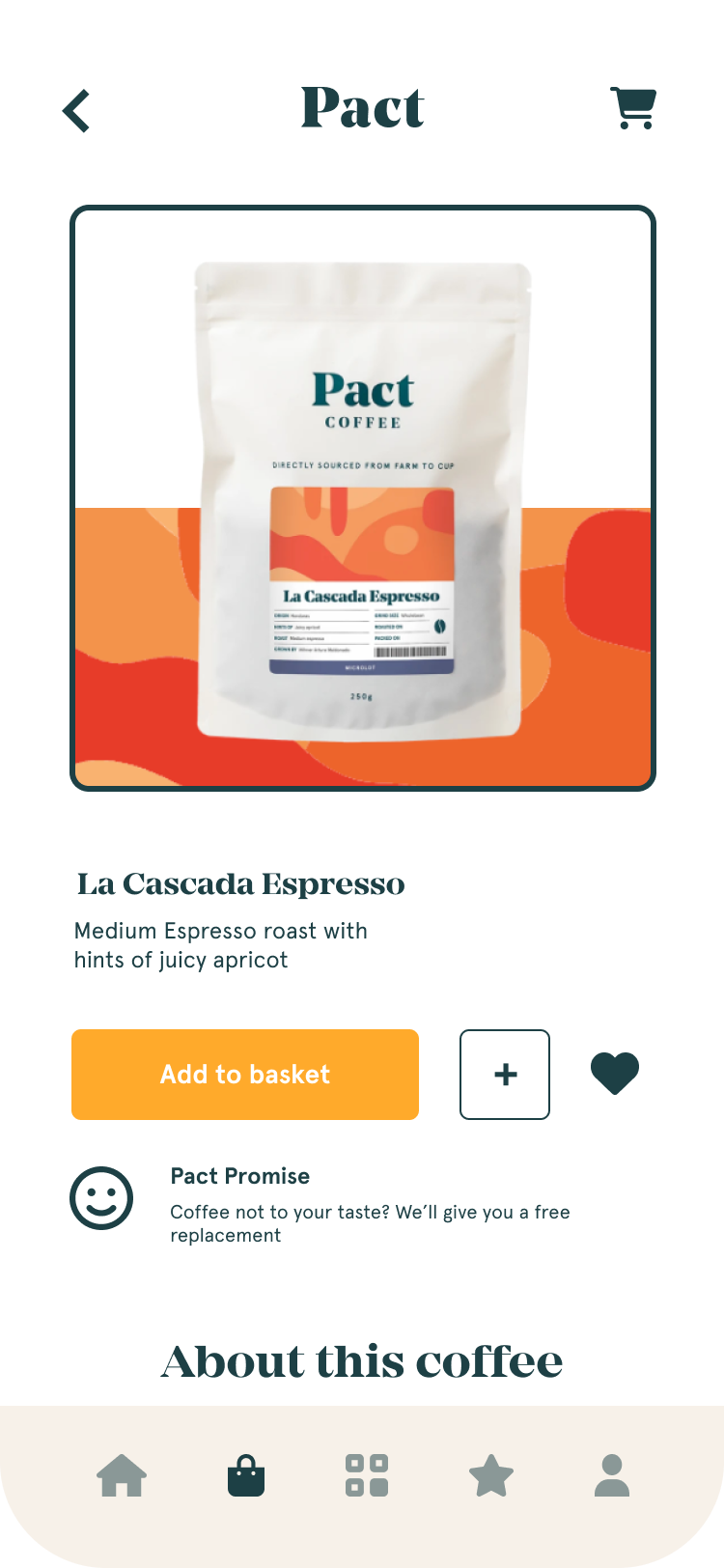
PRODUCT PAGE
The product detail page was designed to help users make informed purchasing decisions while reinforcing the story and craftsmanship behind each coffee. I focused on presenting information progressively, allowing users to quickly understand key details such as tasting notes, origin, roast profile, and pricing without overwhelming them with dense content. Rich imagery and structured layouts were used to create a premium editorial feel aligned with the Pact brand.
This page demonstrates my approach to balancing emotional storytelling with e-commerce functionality. In addition to supporting conversion-focused actions such as adding items to basket, the design aims to deepen user appreciation for the product itself.

SHOPPING BASKET
The shopping basket was designed to create a seamless transition between browsing and checkout while minimising friction in the purchasing journey. I focused on providing users with clear visibility of selected items, pricing, and quantity controls while maintaining a clean and uncluttered layout. Strategic use of hierarchy and spacing ensures users can quickly review their order and make adjustments confidently before proceeding.
From a business and UX perspective, this page plays a critical role in conversion and abandonment reduction. I considered common e-commerce pain points such as unclear costs, accidental quantity changes, and disruptive navigation flows. The final design prioritises reassurance, transparency, and efficiency, helping users feel in control throughout the checkout process while maintaining visual consistency with the wider product ecosystem.
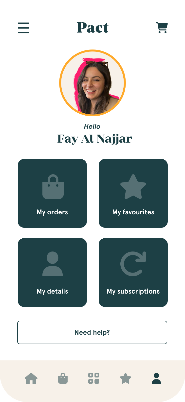
USER PROFILE
The user profile page was designed to provide users with control over their preferences while maintaining a simple and approachable experience. I focused on reducing complexity by grouping settings logically and using familiar interaction patterns that minimise learning curves. The interface prioritises clarity and accessibility, ensuring users can confidently manage account details, notifications, and preferences without friction.
This screen reflects my attention to designing supporting experiences that are often overlooked but essential to overall product quality. Rather than treating settings as purely functional, I considered how the profile area could reinforce trust, transparency, and brand consistency. The design also supports scalability for future features such as subscription management, saved preferences, or loyalty integrations.